Newcon Design Challenge
Create a compelling and engaging about us page for Newcon.io
TOOLS
Figma, Miro
METHODS + SKILLS
Product Design, UX Writing + Strategy, Content Design, Product Marketing, UI Design
DURATION
72 Hours
TEAM
Labiba Amyeen
ROLE
researcher, UX writer, visual + interaction designer
overview
In this design challenge for Newcon (an early stage start-up), I was asked to build an “About Us” Page. Newcon provided me with the copy asked me to design an “About Us” page based on it. Ultimately, I realized Newcon had a larger root issue: bad UX writing. This project ultimately pivoted to a in-depth study of UX content strategy and it’s impact on design.
project outline
1. research
Understanding the ask and analyzing competitor web pages to determine what works and what doesn’t in an “About Us” page
2. ideation
Breaking down the Newcon copy + putting it back together to make it more digestible
3. prototyping
Bringing the ideas to life via Figma prototype
THE ASK
Create an about us page for Newcon that
(1) provides the user with a feeling of belonging and closeness to the company
(2) tangibly showcases the company’s culture
This translates to how can we make users passionate about Newcon by …
1. Explaining Newcon’s mission
2. Getting them to “cheer on” the Newcon team
RESEARCH
competitive analysis
For each of the “About Us” pages I analyzed, I asked the follow four questions to analyze the product in each of these areas.
product
What product is being sold?
task
What is the goal of this landing page?
successes
What makes this design stand out?
pain points
What is frustrating about this design?
competitors
# 1: AIME
# 2: passionfroot
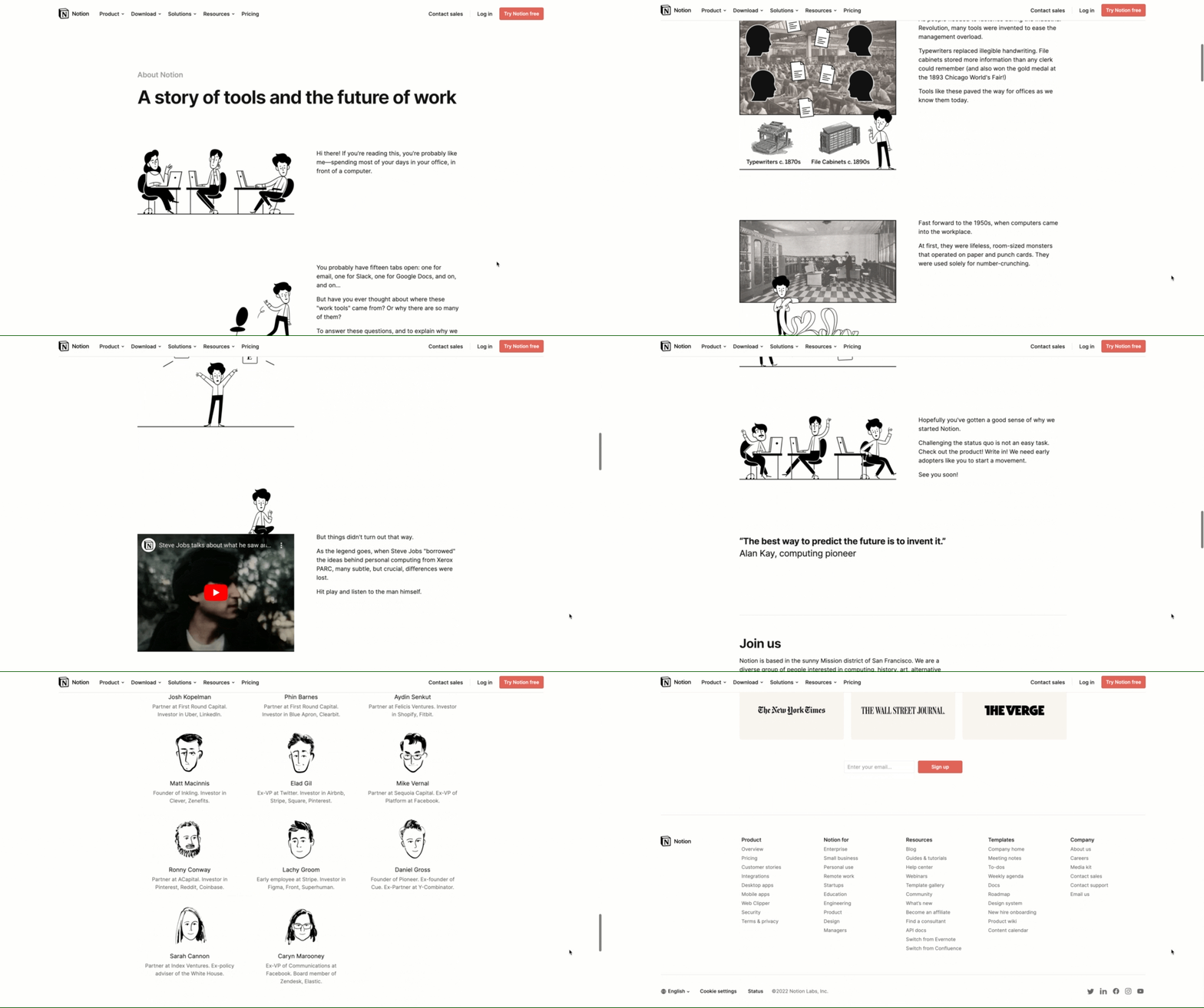
# 3: notion
# 4: coda
RESEARCH
key insights
What separates differentiates a good vs. great “About Us” page?
#1. Keep it simple + short
No one is reading giant blobs of text
#2. Include pictures/compelling visuals
Pictures >>>>> everything
#3. Telling a story is about relating to the user
Take a look at Notion’s copy-writing
IDEATION
UX writing + content redesign
After taking a look at our competitor “About Us” pages - the next big step in this process was to redesign the content from the given page to make it more user-friendly
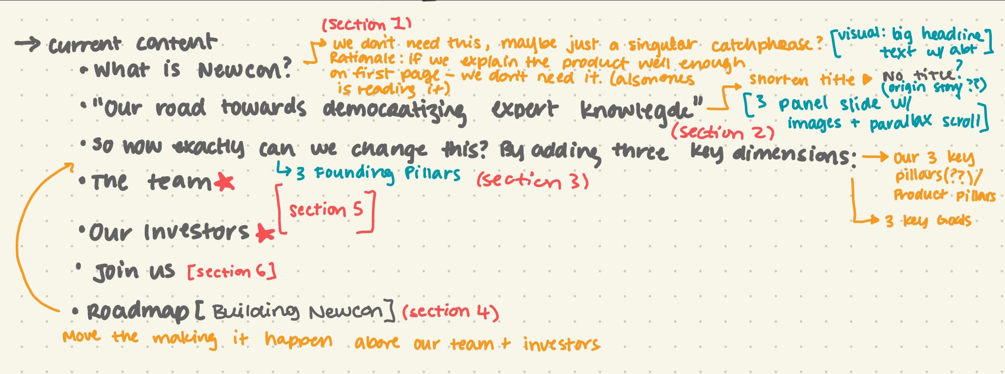
1) reorganize content
I began my work by taking the existing copy and analyzing it to find distinct sections I could work with. I took notes on where there were natural breaks in the content on the current copy and brainstormed how to rearrange/rewrite the massive amounts of text to make it more engaging.
2) rewrite copy
After reorganizing the copy, I created a google doc with the new copy. I focused on:
1) Creating short and distinct headers
2) Writing from the perspective of the user
3) Cutting unnecessary copy
Detailed rational + in-depth comments on content writing strategy can be found on the google doc. Please click the link below if you are interested in learning more!
3) lo-fi prototype/sketch
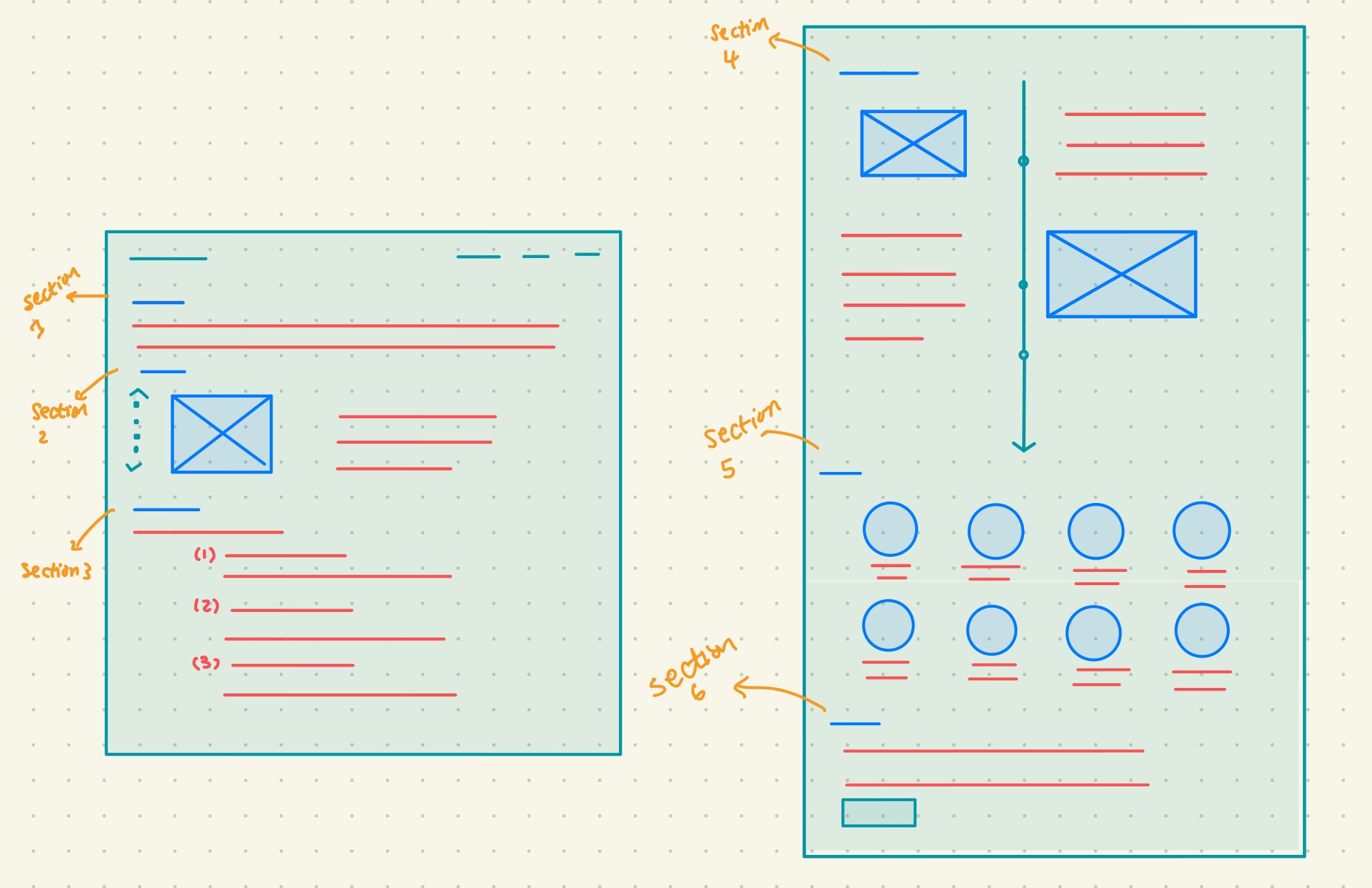
Following the copywriting, I created a lo-fi mockup of the format of the “About Us” on my iPad
PROTOTYPE
This simple one-liner replaces the “What is Newcon” section in the draft copy
Rationale + Highlights:
Short + Sweet - colored text is attention-grabbing and short to ensure people continue reading the page
Synthesize info - user already knows what Newcon is based on browsing the landing page. Replace repetitive copy with a heading.
Recommendations:
Come up with a tagline - This tagline is based of my general understanding of the product but it would be beneficial for Newcon to have a standardized tagline about the product for product marketing purpose
section 1: product statement
section 2: our origin story
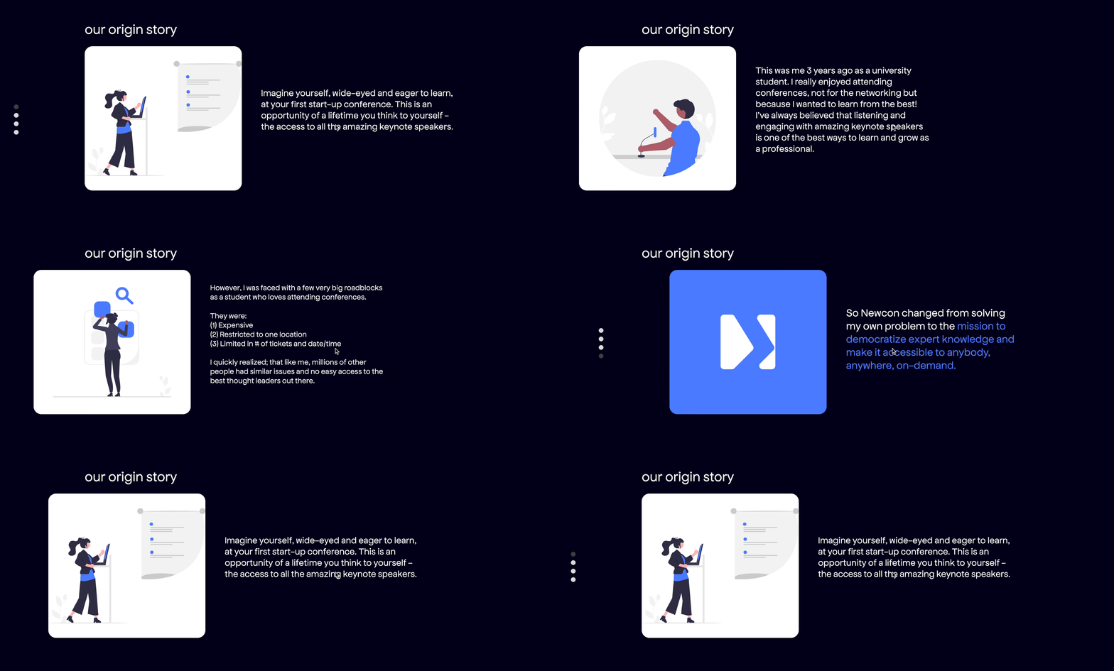
This card carousel is meant to turn the “Our road towards democratizing expert knowledge” section into a interactive and fun format.
Rationale + Highlights:
Shortened Heading - “Our origin story” is short, sweet and personable as a heading
Carousel Format - helps reduce the cognitive load on user and breaks down hefty copy into more digestible pieces. Progress bar tells users where they are in the story (less likely to scroll away)
User perspective - story starts from user’s perspective (“Imagine yourself”) ensures the user is more invested in the narrative
Simple illustrations - Illustrations in this section allow users to visually follow the narrative.
Recommendations:
Consider a horizontal slider? - I did play around with this idea but I felt that vertical scrolling made more sense. See right for iteration.
section 3: founding principles
The Founding Principles section replaces “So how exactly can we change this? By addressing three key dimensions:” and provides a clear conclusion to section 2 and allows for a segue into section 4.
Rationale + Highlights:
Changed Heading - reframing this copy as the “Founding Principles” creates a more cohesive narrative throughout the page
Concise copy - Shortening and cleaning up the copy for this section makes it easier to read and understand
Recommendations:
Animated text - it may be nice to create some sort of rotating gif with the text of founding principles
section 4: building newcon
The Building Newcon section is a more concise version of the copy at the very end of the draft.
Rationale + Highlights:
Rearranging sections - It made more sense to bring this section above the our team + our investors section to continue the narrative of Newcon and how it came to be.
Hyperlinks - I added hyperlinked text and added a visual for the hyperlinks to make the text more interesting.
Alternating visuals and text - The alternating format is similar to the Passionfroot page and is meant to make the story more engaging and timeline-esque.
Recommendations:
Extend vertical visual - the section spas the height of the desktop and has a floating header but this could be played around with
Create animate slider/progress bar - vertical line is a static visual right now but it could be more interactive
Storyline -this story could be more cohesive and feel less abrupt
section 5: team + investors
The design for this section was relatively straightforward but here a few recommendations to make it more interesting.
Recommendations:
Social Links - add linkedin or twitter links to the bios (see Passionfroot) to make page more interactive
Interesting Bio Taglines - users may feel more connected to the Newcon team if bios were more interesting/included short fact about members (see Coda teams section)
section 6 & 7: note from our founder + join us
These two segments are the concluding statements from the “About Us” page.
Rationale + Highlights:
Rearranging Copy- I tested the “note from our founder” section location a lot and settled on putting it at the end because it is a lot of copy and I didn’t want the users to be deterred from scrolling through the rest of the page
Recommendations:
Concluding sentiment - reframe this copy to better conclude this page and segue into join us (ie: thank the user somehow)
Check out the full Figma prototype here!
REFLECTION
Copy-writing/editing
I think UX writing is a very underrated aspect of being a product designer. In the case of the Newcon About Us page, a lot of it really boiled down to what should I keep + how do I frame this to sounds more like a compelling story.
Microinteractions + Feedback
I would have liked to fine-tune and add more interesting micro interactions like I discussed in the prototype section and would have liked to iterate this design with more feedback
concluding sentiments.
What things went right + what went wrong?
User Testing
With more time, I’d love to have people test the app. I would’ve also to have done general usability testing and make sure our app met the UX laws + standards
Intentional Messaging
With more time and context, I would’ve really like to discuss more of what you would like to showcase about the Newcon product + frame the messaging of the About Us page in a way that aligns with the rest of the content.
Photo carousel
I would’ve liked to add the photo carousel somewhere towards the end of the page as a fun little concluding segment - also consider putting more culture content on the careers page or something
future iterations.
What are things I would’ve like to add/do differently?


